
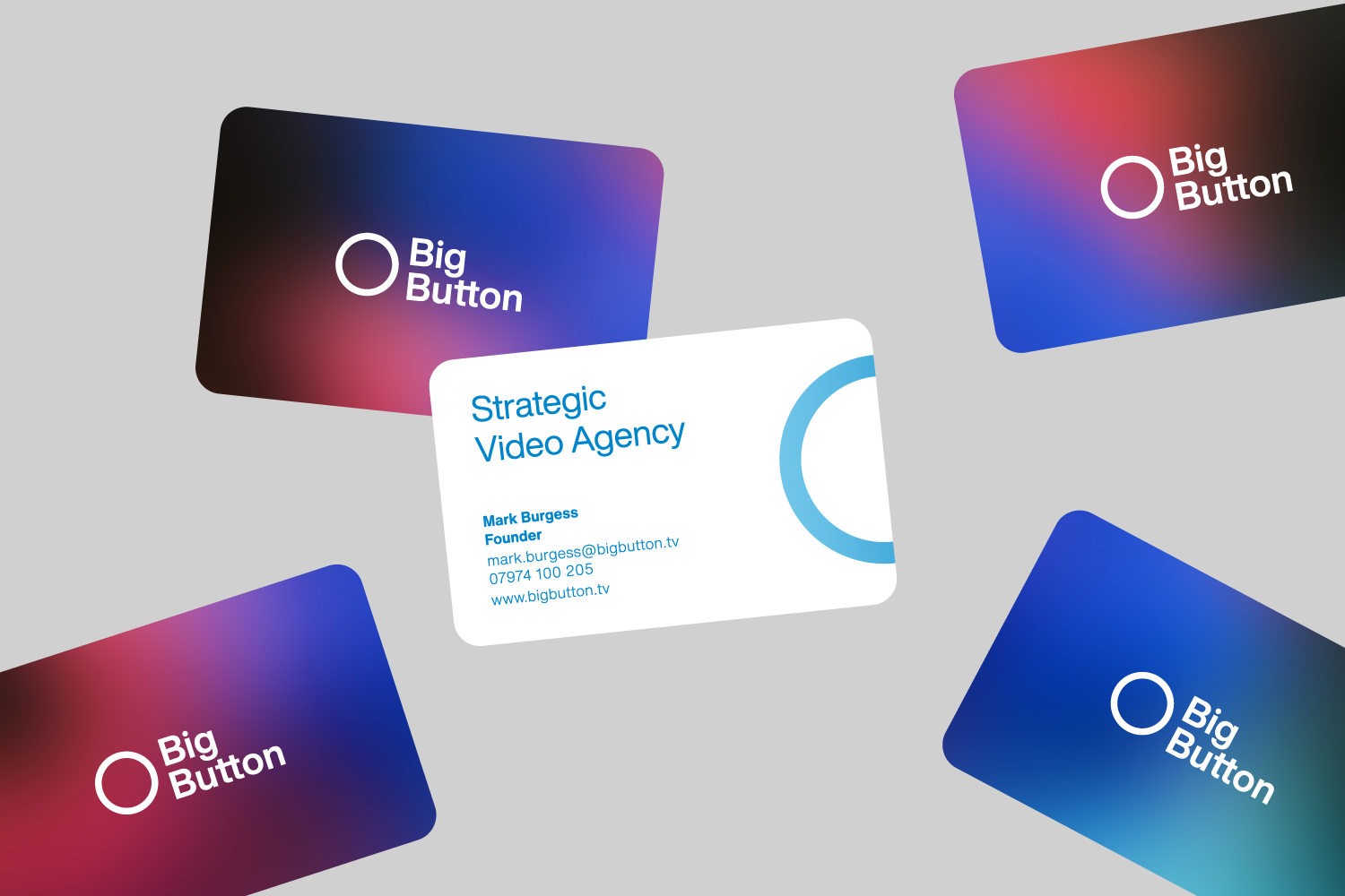
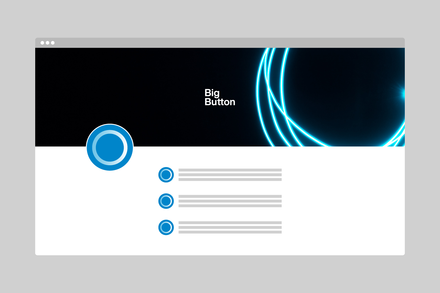
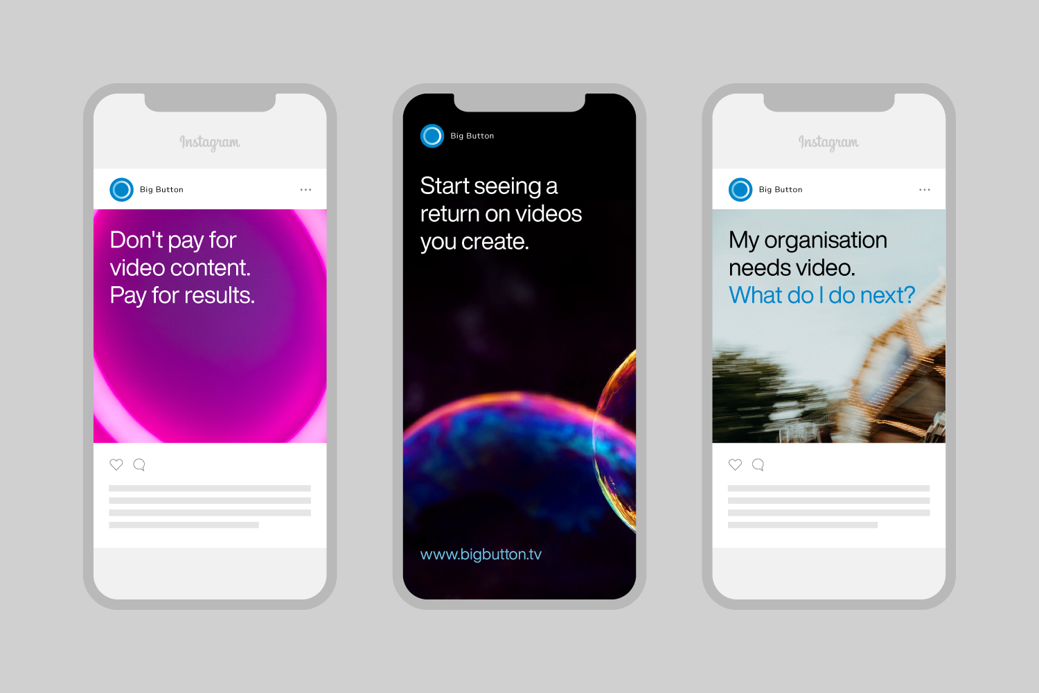

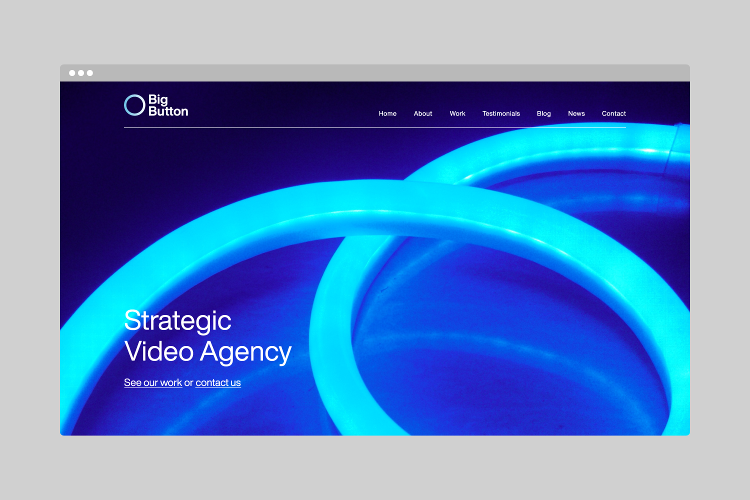
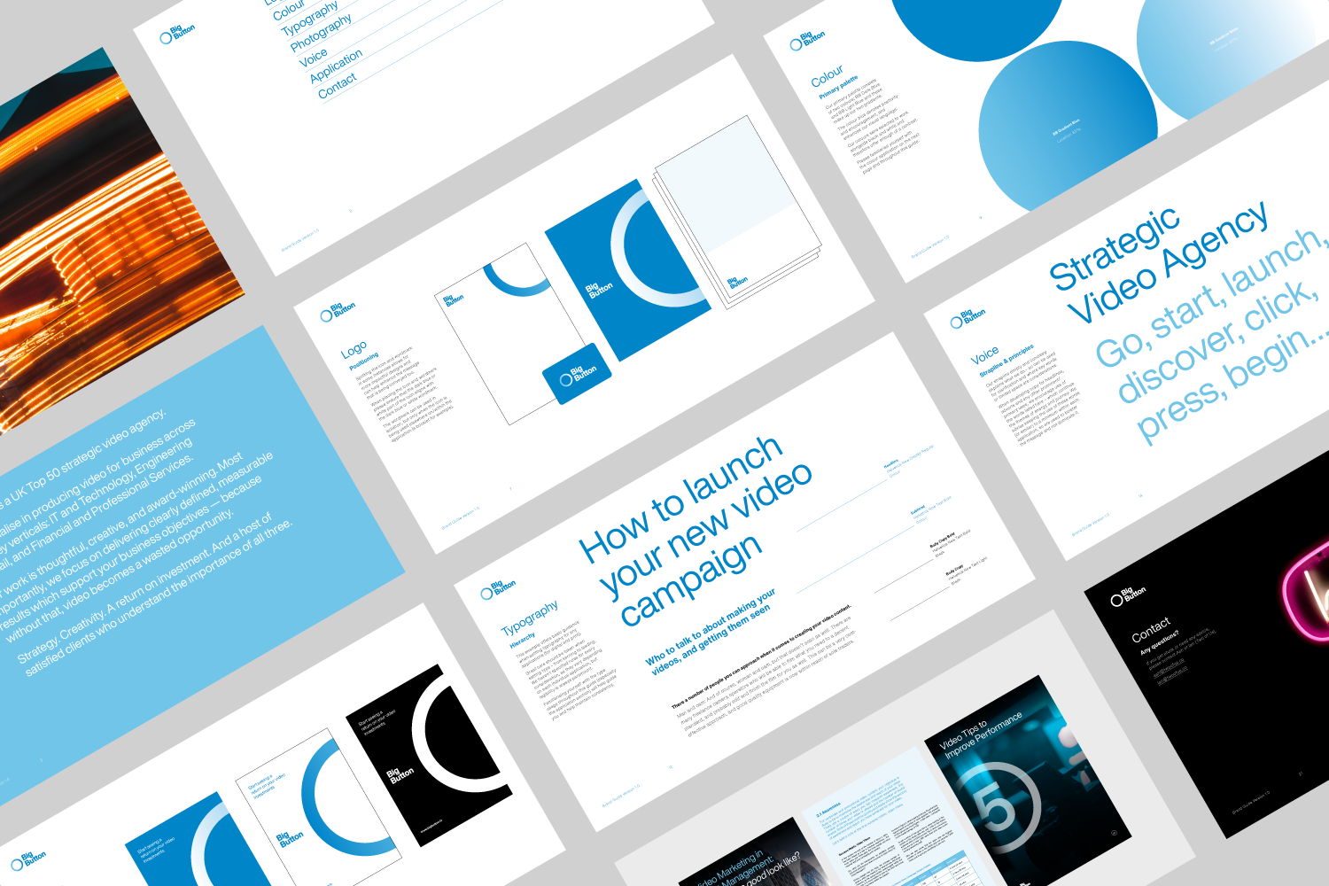

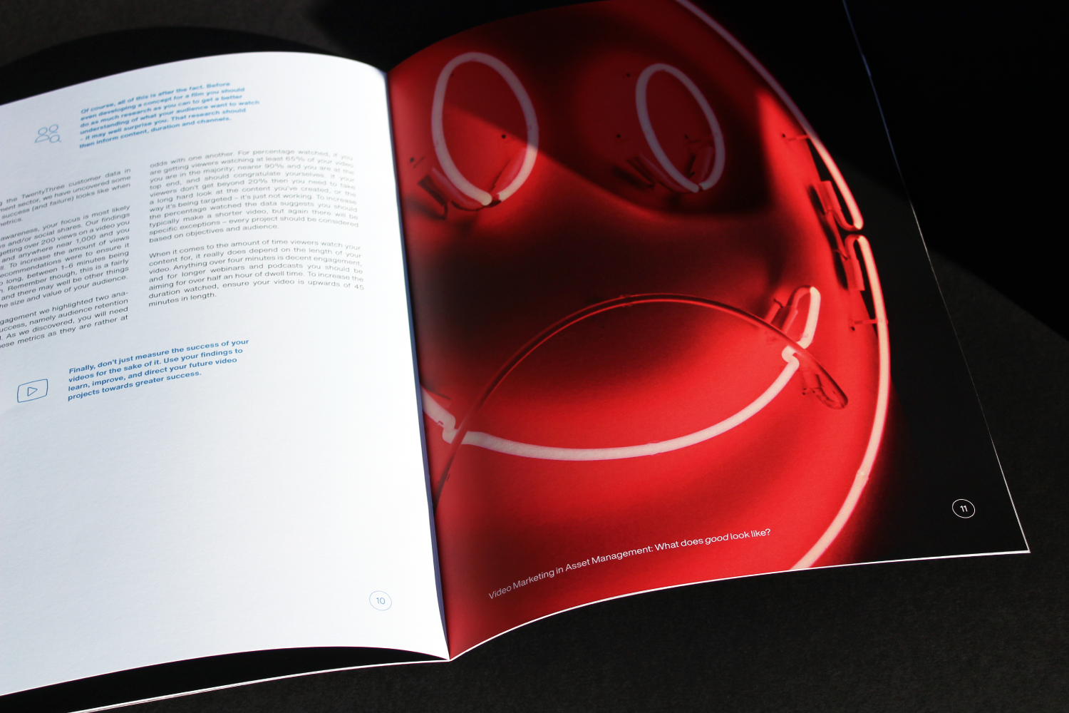

Big Button is a strategic video agency that partners with organisations to deliver maximum success from video. The circle (button) is a key component in the new visual identity. It represents the ongoing relationship and partnership between Big Button and their clients, which is central to successful video outcomes. The imagery, colour gradients and tone of voice enhance the idea of a journey — by capturing themes of motion.
This project follows on from our successful rebrand of Buto, the former sister company of Big Button.
This project follows on from our successful rebrand of Buto, the former sister company of Big Button.
"Two of Us's process is methodical and clearly laid out at the outset, and their approach to competitor and sector research is very thorough. The work they produced for the rebrand was thoughtful, inventive and original — but most importantly, all aspects were completely coherent. This coherence really shone through in the final stages, when the new branding was applied across all of our marketing collateral. We are delighted with the results; the guys are fantastic to work with, and I would have no hesitation in recommending them." Mark Burgess, Founder
Industry
Video
Technology
Project scope
Research
Identity
Print Design
Web Design
Credits
Project: Two of Us
Video
Technology
Project scope
Research
Identity
Print Design
Web Design
Credits
Project: Two of Us

